March 3, 2016
We have been using your Basecamp 3 project management software for a few months now and we’re happy to say there are some great new features. We love the ability to properly create links in messages to clients, the ability for clients to respond without needing to have an account, and of course giving applause (collecting coins) to our team when something great happens (okay not a feature but cute).
We recently have also started using the new app for Basecamp and it has been useful in unexpected ways. I’ve actually found myself saving time hunting through tabs because the dedicated application is always available for me to find in my dock. I’m also happy that you can still switch to Basecamp 2 right from the app and the fact that it opens natively in a separate browser tab is one less step from the old method for me as well.
We’ve been enjoying the more traditional email feel of the client side messaging system as well, but we’ve had a couple of issues that we would love to see fixed too.
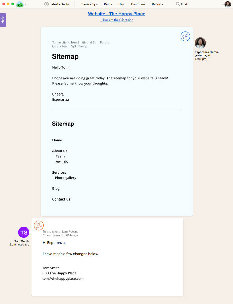
If you’ve ever emailed a client a list of things that you need their feedback on chances are you’ve had one of them reply directly in the quoted text of your email. Their message will say something like “answers below.” This saves the client time, and for the most part is easy for everyone. Here’s an example.
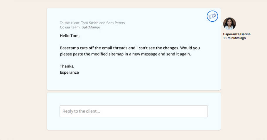
 In Basecamp 3 however the quoted text from previous emails is not available for viewing. Yes this is handy to remove unwanted quoted text with strings and strings or replies, but it this case it actually makes our lives harder. It means we’re sending the client an email explaining how our project management software doesn’t allow us to see previous emails, and that we will need them to resend their answers in the body of their email.

That’s where the finger wagging while standing on our soapbox comes in as this slows down the project, and costs more time for everyone involved. We’ve thought about solutions and have a suggestion to fix this little issue.
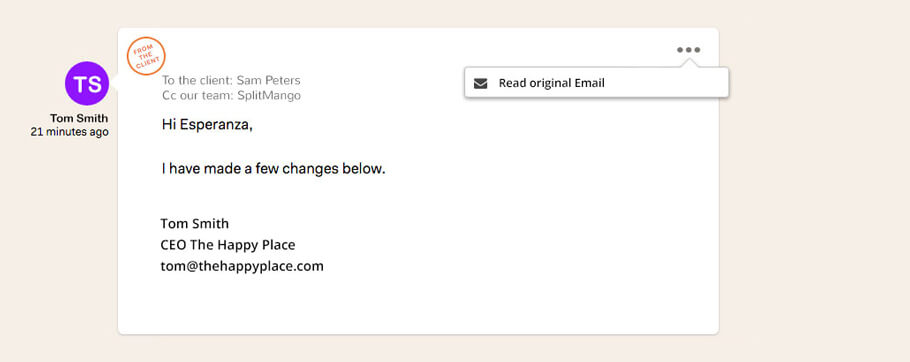
If there was a small menu button on the top right of the message that when clicked said “Read original Email” the user could then click this option to view the original email as if it were to be delivered to your normal email client. Here is an example of how this could look.

As you can see it’s a relatively simple solution from a design perspective that could save agencies and clients time. We’ve also found that when a client uses bold, colours, strike-through or other text styling options they do not show in a normal reply. This poses a similar problem where “Answers in red” becomes all text in black and hard to scan quickly. We’re sure there is a fix available for the text styling issue as well and would love to see that soon. Reducing the pain points with any project management software is bound to improve user experience/happiness and we hope that Basecamp will please consider making these changes. Keep up the good work!
SplitMango
Update: Basecamp 3 has now released an API and we are hopeful that this issue will be resolved by their team shortly, or by the community of Basecamp users. In the mean time we encourage Basecamp 3 users to try creating visual statuses for their projects with MangoBoard. Create a custom project pipeline that helps you organize and track your Basecamp projects as they progress. Simply create custom columns that you can drag and drop your projects into to show their current status. We use columns such as Design, Development, and QA for example.