December 16, 2015
1.5 Minute Read.
Design is always evolving.
Look back even two years and drop shadows were seen as distasteful. Using the style was a sure way to get a design sent back to Photoshop. That quickly changed when Google introduced a subtle level depth to their design philosophy, Material Design.
Drop shadow isn’t the only thing that’s changed lately though.
We are here to help guide you through those misty waters with a look into our design and development crystal ball for 2016.
Responsive Web Design
Responsive Web Design isn’t new to the coming year, but the way we approach it is. Only a year or two ago we could arguably count the device resolutions that our sites would be viewed on a hand or two (okay maybe we would have to use a foot or two as well).
No longer. Now sites are being built like elastic bands, they need to look great across all resolutions, large and small.
Hero Banner Backgrounds

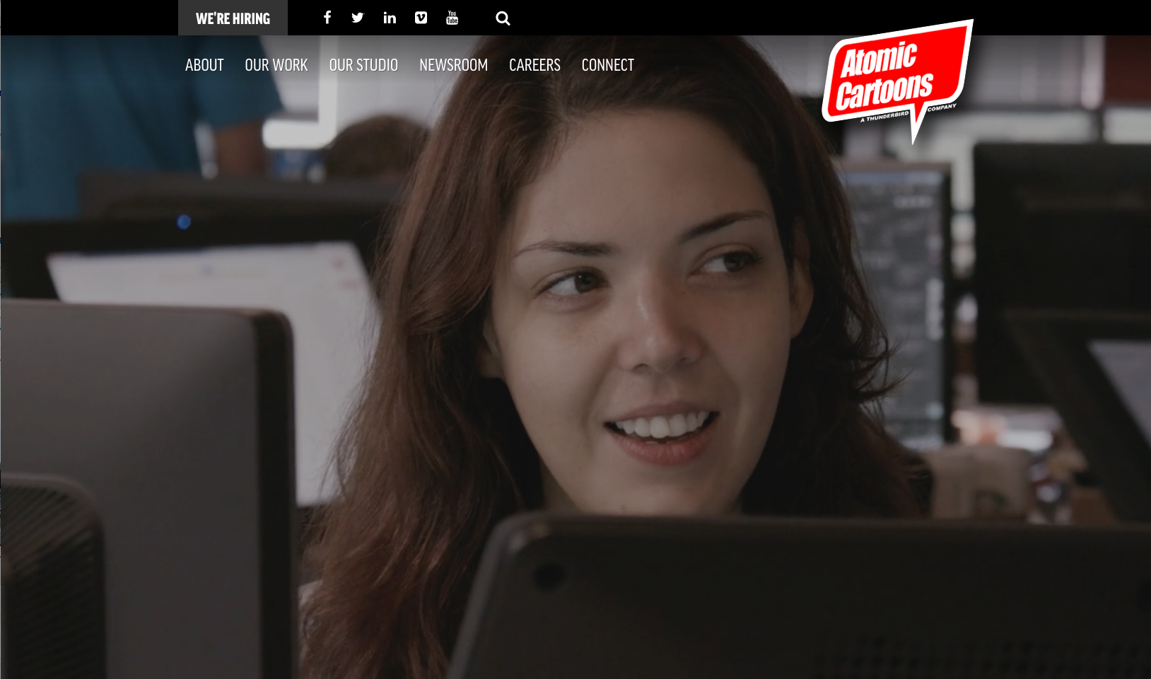
Large images saw a lot of attention in 2015. Beautiful images from sites such as unsplash.com and stocksnap.io brought a natural and relatable touch to the first impression of many sites. They are a breath of fresh air when a user first lands on a website.
Next year they aren’t going anywhere, they are about to evolve. In 2016, we will see more background videos, likely silent, short and looped.
These videos will often have a coloured overlay so the banners can still have links and text over top of them.
Smaller Page Height

We tend to think that as our technology progresses that our desktops screens will get bigger, but the majority of consumers seem to be headed in a different direction.
Even though many technology media sites and blogs are drooling over large 4K monitors, the stats are showing that most sites are being visited by notebooks with often a very narrow aspect ratio.
Responsive Web Design means that our sites must look great on both, but with the majority of traffic coming from these smaller devices, you will be seeing sites that look natural on these screens and add additional white space on the bigger displays.
More Scrolling
In 2015, we saw the rise of white space. Content was often shortened and given room to breathe with the addition of plenty of padding around it. It is not unusual to see only a heading and a piece of content on the screen at the same time.
This style is often paired with strong typography and bold colour to help the user concentrate on what matters, the content. These sites were treated as visual experiences.
2016 points to a goal focused evolution of this trend. We will likely see content that focuses on telling its story in a way that its sites visitors love, and then providing actions for the users to continue their experience.
This will evolve beyond the “Call-To-Action”, “Read More” and “Contact Us” buttons. Choice will be part of the journey, so as the content scrolls users in 2016 will the provided with contextual paths to find the content that is important to them.
Cards

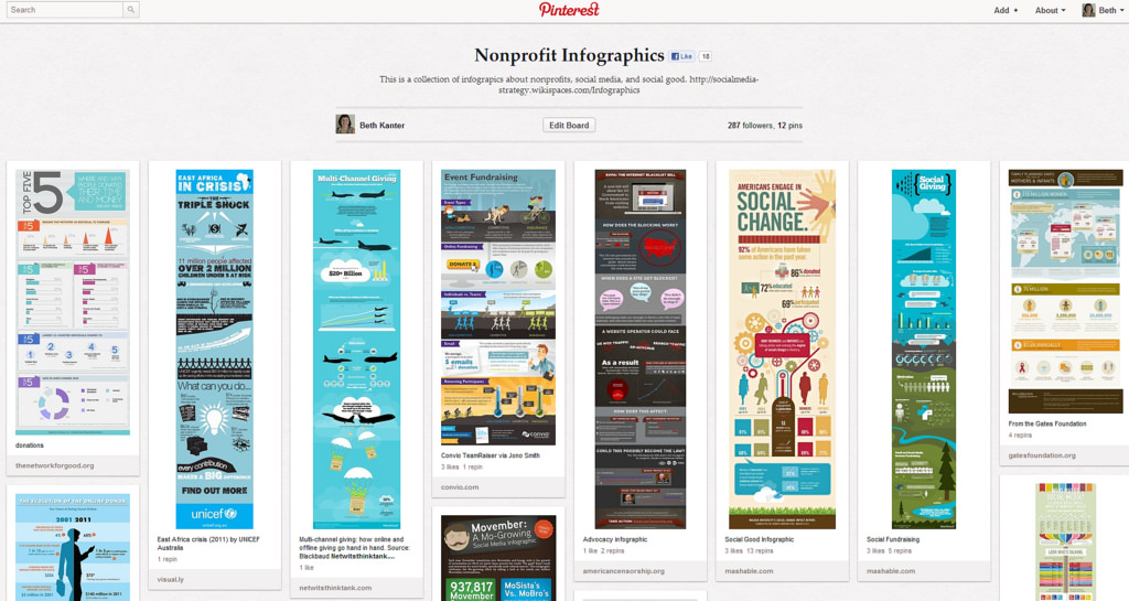
Pinterest is the silent giant on the web. Although you may not hear about it over Thanksgiving dinner or on the news, it has a large engaged user base that has had a great experience with their product and their design.
The design element that has helped this quiet revolution is known as “Card Design”. Pinterest has spearheaded this by sectioning its posts into easy to define cards that can be interacted with.
Welcome to 2016!