April 22, 2015
Google has started to penalize sites that are not mobile friendly or responsive as of April 21st coined the “mobilegeddon”. If your website does not adapt or respond in the proper ways to make it more user friendly on phones and tablets then they will remove you from mobile search results.
Small business owners could potentially lose more than 50% of their overall traffic!
All is not lost though. Almost any site can be converted to have a mobile responsive layout that adjusts to fit any device the user may search from. The best part is your new mobile responsive website will be designed to allow your users to better navigate and interact with your website. That means less frustration, and headaches from zooming in and out or trying to keep your hand steady to press tiny buttons like you’re a surgeon on the operating table!
So how does one find out if their site is prepared for this Google Update?
Firstly, grab your smartphone or a friend’s and go into the mobile browser. On an iPhone this will be Safari and on Android this will be the Default Android Browser, Google Chrome, or one of the other options available.
Next, type in the url web address of your website, for us that’s www.splitmango.com! Once you’ve hit enter/search/go you should be taken to your website.
Does your website look the same as it usually does when you see it on a desktop?

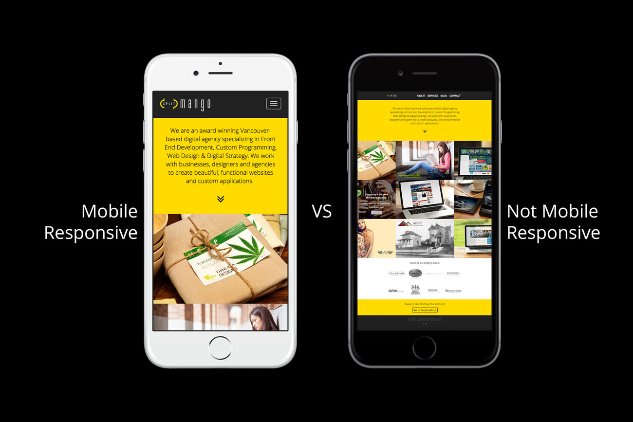
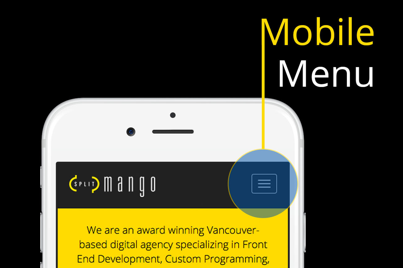
If that’s the case then the text is going to be small and you’re probably going to need to zoom in and out just to use the navigation. While on that topic if your site is responsive you should see some large buttons ideal for clicking with fingers as opposed to a mouse pointer. Or you may see a button with 3 horizontal lines that when pressed brings out a mobile menu that you can easily navigate using.

Even if your website has a mobile layout consider how usable it is.
Can you read the content easily or get to where you’re trying to go without waiting a long time?
If you have a mobile website that’s not user friendly it’s really not doing you or your customers any good, and Google knows whether your site is helpful to visitors through analytics.
Now let’s hop onto a desktop or laptop and have a look at the site at different window or viewport sizes. Open up your website in any browser, once it’s finished loading take the right side of the window by click and holding the mouse down and drag it to the left to shrink the browser window.
As you move the mouse to the left the window should decrease in size, while this is happening a mobile responsive site will adjust the content layout and sizes to fit the window. Give it a try on SplitMango’s website if you want to see this in action.

If your website is not mobile responsive you should seriously consider upgrading your website
The longer you wait to make the change the greater your risk of losing significant traffic. Not all websites rely on mobile for traffic, and you should look into your analytics to get an accurate picture of how users are reaching your website. You can check exactly how Google sees your website on mobile using there test for reassurance.
SplitMango has done and continues to do mobile conversions for businesses trying to better reach and serve their clients with a quality product. We understand the importance of usability and work with our clients to make their website powerful and practical.
Give us a call to find out more on how you can convert your website to mobile and gain back any traffic you’ve lost or prevent you from losing it in the first place.
Thanks for reading